
Trying to choose the perfect white paint color for your home? (me too, girl, me too!)
Let me guess … it’s way past your bedtime, and you’re still scrolling Instagram and using the search bar to find houses painted with ‘Simply White’ and ‘White Dove’ and ‘Chantilly Lace’ and ‘Swiss Coffee at 75%’.
You’ve typed “white color drenching” into Instagram so many times your feed is basically one giant white wall. (or is this just me?!)
Then you head over to Google or ChatGPT for alllllll the white comparisons … ‘Simply White vs Extra White’, ‘Simply White vs. White Dove’, ‘White Dove vs. Chantilly Lace’, ‘White Dove vs. Pure White’, ‘Simply White vs. Swiss Coffee at 75%’, etc.
Maybe you’re sitting at dinner the next day, and your family says, “Can we please have one dinner where we don’t talk about paint?”
Or your husband says, “Wait, I thought we already picked a white. Why are we talking about this again?”
I’m right there with you!
I am right there with you … as in RIGHT NOW. My husband is SO over the white paint conversation, and my girls literally asked at dinner the other night if we could please not talk about paint. 😆
I’ve been hyperfocused on white paint for the past couple of weeks because we are purchasing an existing house (crazy, I know … here’s the story) and my first order of business is to color-drench that baby in the ‘perfect’ white paint.
I’m so hyperfocused on the undertones of white paint that I’ve caught myself evaluating the walls E V E R Y W H E R E … at my PT appointment (sterile and blah), at Starbucks (too creamy), and even the trim color behind my business coach while I was on a Zoom call (yellow-y undertone).
(Funny how you never notice white paint around you until you are trying to find the perfect color. I’ve lived with the same white – White Dove – in my current house for 13 years and never once noticed it until now.)
So here’s what I want YOU to know … IT’S NOT JUST YOU!
Choosing a white is genuinely HARD (the hardest), even for those of us who live in the design world.
In this post, I’m sharing my exact method for choosing and testing white paint colors because I want this to be as easy as possible for YOU!
Affiliate links are used for your shopping convenience. Please read my full disclosure here.
Links Mentioned in this Episode:
Why picking “just white” is so hard
Picking a white color is hard because there is no such thing as “just white“.
Every white shifts depending on three things: undertone, light, and sheen.
These three things are WHY the same paint color can look perfect in one room and wrong in the next … or stark white in one room and creamy in another.
Undertone
Every white has an undertone of some sort. You can’t get away from this.
Some whites lean creamy or yellow, some lean gray, some lean cool and crisp, some almost have a blue hue.
You often can’t see the undertone until it’s next to another white.
This is exactly WHY it is SO important to test white paint colors against each other (and against white paper).
Light
Lighting plays a big role in how white paint looks as well.
North-facing rooms get cool, gray light that can make a crisp white feel flat.
South-facing rooms, on the other hand, get warm light that can push a creamy white toward yellow.
Sheen
Sheen is another biggie that affects how your white paint looks.
The glossier the finish, the more a white shows its undertone.
I have experienced this firsthand in my current home.
I have Benjamin Moore White Dove ALL over my house … our ceilings, trim, doors, cabinets, and some walls.
I’ve LOVED it for the past 13 years, but it looks very different depending on the sheen (and lighting).
On my glossy cabinets it reads almost yellow at times (especially under artificial lighting at night).
On my satin trim it looks far less creamy … and runs the gamut of stark white to a slight yellow hue.
On my eggshell bedroom walls it’s a beautiful white (no yellow undertone peeking through), but eggshell in our windowless closet makes it look a little dull and gray.
Same paint.
Same house.
Totally different personalities.
This is WHY you can’t pick a white from a paint chip or someone else’s Instagram post.
You have to see it in YOUR light, in YOUR sheens, and next to YOUR fixed finishes.
(Caveat … I have never been hyperfocused on the yellow and dullness in my White Dove until the past couple of weeks as I look for a white paint color. I’ve lived in this house for 13 years and have loved the White Dove! It’s a great soft white.)
How I’m Choosing my White Paint Color (and how you can too)
- I started with the current white existing in the house we bought (I was seriously hoping I could make this white work to save money, but it’s too stark), plus I made a list of popular soft white colors. (My favorite designer whites post is a great place to start.)
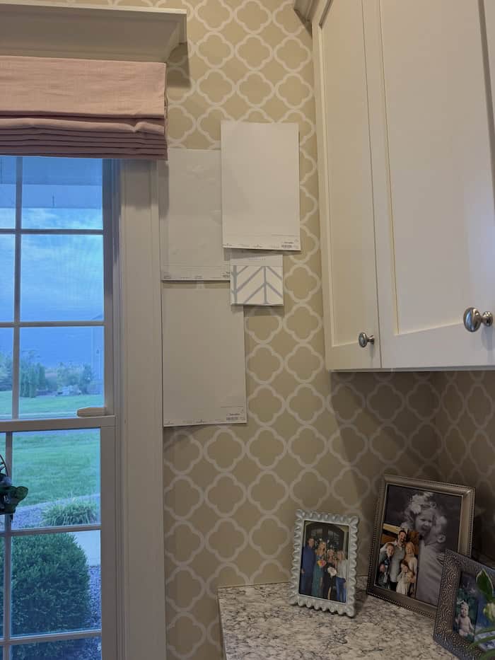
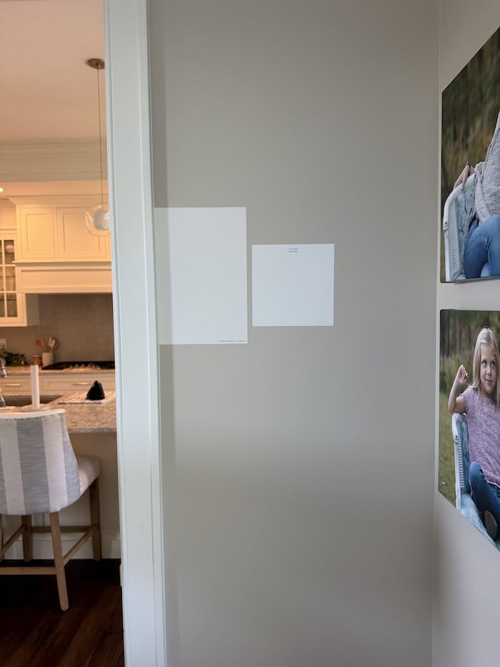
- I ordered multiple peel-and-stick samples of each color. I use Samplize EVERY. SINGLE. TIME. because … no wet paint, no mess, no cleanup, and you can move them around the house. (Learn alllll about Samplize in my updated Samplize review.)
- I hang the samples on my walls in various rooms and I leave them up for days so I can see the colors in all lighting … morning, noon, and night. Unfortunately, a white that looks dreamy at 10am can look totally different at 7pm with the lamps on.
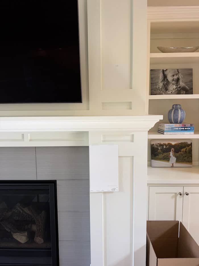
- It’s helpful to compare against a white you already know. This was the game-changer for me. I hung my samples right up against the White Dove in my current house, in both north- and south-facing rooms. Seeing the colors side by side showed me instantly which ones read too creamy (or stark) for me.
- See how the color looks with your fixed finishes (countertops, tile, flooring, window grids, etc). Your white has to work with these.
Caveat to number 5 … If you’re in an existing home or purchasing an existing home, separate what’s permanent from what’s temporary.
For example, the kitchen cabinets in the house we bought are an almond-ish off-white, but I’m replacing them next year, so I’m not matching my white color drench to them. If you’re planning to remodel a room soon, don’t let the current finishes make the decision for you.
If you are building, hang the paint color samples in your current home … just keep in mind that the color might look slightly different in your new home, so do a final test in your new home before ordering paint.
Let’s talk color drenching (in white)
You may have heard the term “color drenching” lately. (it’s all the rage!)
Color drenching means painting your walls, trim, ceilings, and doors all the same color, but in different sheens for contrast.
Designers tend to color drench a lot with bold colors, but an all-white drench is my personal favorite.
An all-white drench is calming and makes a room feel bigger … plus, you never have to worry about two whites fighting each other. (I’m not a fan of mixing and matching whites)
In my current house, White Dove is on all our trim, cabinets, doors, and ceilings, plus the walls in three bedrooms and all closets. Our main living areas have Sherwin-Williams Accessible Beige walls, broken up by LOTS of White Dove trim.
In our new house, I want the full white drench, and it’s the one part of this decision I know I won’t regret. (I just need to make sure I choose the *right* white because it’s an EXPENSIVE decision … and I don’t want to mess it up!)
Interior White Paint FAQs (I’ve googled some of these!)
Here are some FAQs about white paint:
Do I paint the ceiling the same white as the walls?
Yes, if you want a true drench. The same color goes everywhere, and you let the sheen do the work of defining each surface.
Even if you’re painting the walls a different color, I ALWAYS recommend painting your ceilings, trim work, cabinets (if applicable),and interior doors the SAME white. When you mix and match whites, the undertones really pop out (and it rarely looks good!).
What sheens should I use?
Here’s exactly what I’m using and recommend:
- Ceilings: flat
- Walls: eggshell or a high-quality matte (my painter suggested matte, and I think that’s what I’m leaning toward in my new house … less shine!)
- Trim and doors: satin (I personally hate semi-gloss and double hate gloss!)
The subtle sheen change gives you just enough definition between walls and trim without a second color.
Can I paint satin over semi-gloss doors?
Yes, but it needs a little prep work. Ask your painter to clean, scuff-sand, and use a bonding primer so the new paint actually sticks.
(in full disclosure … I just learned this from my painter!)
Should the primer be tinted?
If your painters are priming, ask them to tint the primer to your white. It helps you get true, even coverage with fewer coats. Plus, it gives you a glimpse of what your walls will look like in your chosen color.
(this SAVED me when painting my custom build 13 years ago!)
Will an all-white house feel stark or cold?
Not if you decorate with warmth.
I decorate with lots of neutral organic textures … bouclé, velvet, chunky basketweave, gold accents, and wood. These textures and warm tones are what keep a clean white from feeling stark and clinical, especially in north-facing rooms.
Your white should serve as the backdrop, and your furnishings bring in the warmth.
Unsure what white paint colors to start with? Read 10 White Paint Colors that Designers Love.
The White Paint Color I Chose (99% sure)
White Dove is my trusty favorite, but it reads too yellow at times in my house, and I don’t want that.
I tried Simply White samples, but it read a little too yellow also.
I even considered keeping the inherited White Christmas in the house we’re purchasing (it’s way brighter than what I want, but wondered if it was worth keeping to save thousands of dollars in changing the color).
I ordered peel and stick samples of the following soft whites:
Benjamin Moore ‘White Dove’
Benjamin Moore ‘Simply White’
Benjamin Moore ‘Swiss Coffee’
Benjamin Moore ‘Cloud White’
(you can order white sample bundles … makes it much easier!)
I hung my samples in my current north- and south-facing rooms, right next to my White Dove.
I was able to eliminate colors immediately … Benjamin Moore White Christmas was WAY too stark (and blue undertoned, tbh) and Benjamin Moore Simply White was WAY too creamy (ahem … yellow).
And, again, not sure Benjamin Moore White Dove will work in the new house.
Soooo … I went back to the drawing board (actually, Instagram) and I searched for a popular white that isn’t too stark and isn’t too yellow.
I think I’ve found the perfect (or pure-fect) white … Sherwin-Williams Pure White.
(one of my BEFORE YOU BUILD℠ clients used this ‘color’ and she raved about it!)
Pure White is a soft white similar to White Dove, but doesn’t have that yellow undertone.
I’m 99% sure this is the white I’m going with, but I won’t make a final decision until I slap this up on the wall (when we get possession of the new house) and look at it in different lighting for 2-3 days (day and night).
If it’s too stark, I’ll likely go with my trusty (13 year track record of love) White Dove.
Ok, Your Turn to Choose a White Paint!
All right, now it’s your turn to choose a white paint color.
If you’re stuck in the white paint spiral right now, take a deep breath. You’re not overthinking it.
This decision matters, and caring about it means you’re doing it right.
(It’s a hard decision because there is SO much at stake – including lots of money – when color drenching your house in white. You want to love it!)
Simply narrow your list down to 3-4 whites, stick peel-and-stick samples up in your home, and look at them over several days in various lighting and in various rooms.
Sidenote – go with the white color that YOU want! Creamy whites (e.g. Swiss Coffee at 75%) are all over Instagram and Pinterest right now because they are currently trending. However, if that’s not what you want, go with what YOU want. Separate your design style from what is currently trending (i.e. what one designer loves and millions of people choose because of this).