


Are you looking for the perfect neutral paint color for your walls and one of your top contenders is Sherwin Williams Accessible Beige? If so, you’re going to love this blog post all about Accessible Beige.
I painted my home interior this color almost 8 years ago and I still LOVE it … and so do my blog readers :). I don’t think it’s the *best* color for every home, but I’m going to give you my honest opinion about Accessible Beige and answer some common questions about this paint color.
Affiliate links are used for your convenience. Please read my full disclosure here.
DOES ACCESSIBLE BEIGE LOOK GREY?
Sherwin Williams ‘Accessible Beige’ is a warm, neutral greige paint color that works really well in homes that have plenty of natural light.
I’ve noticed in online forums that people say it lends more to the ‘grey’ side of the greige scale, but it doesn’t present that way in my home (that has tons of natural light).
It really depends on the time of day and the lighting, but I rarely look at my walls and think, ‘wow, they look grey’. It’s just a very soft warm neutral and it’s hard to know how this color will look for you without seeing it in your own home (with samples).
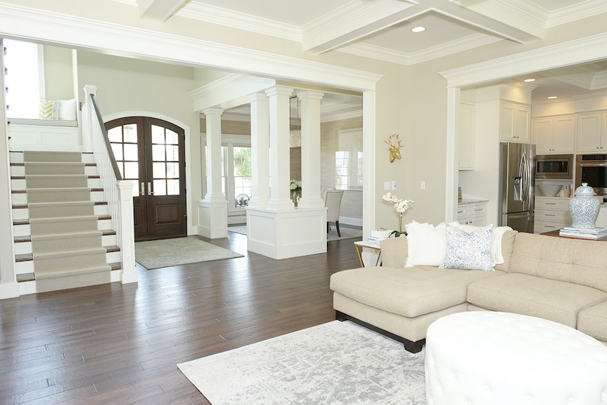
ACCESSIBLE BEIGE PAIRED WITH WHITE DOVE IN MY HOME
WHAT ARE THE UNDERTONES?
Accessible Beige certainly has grey undertones in it, but despite its grey undertones, it’s actually a very warm color. Depending on where you use this color in your home (and what accent colors you use), it will appear slightly cooler or slightly warmer in color.
It looks like beige (not grey) in my home and before we moved furniture in, it almost looked a bit ‘mauve’ (i.e. pink undertone) in our upstairs hall when the natural light poured in. I don’t notice it looking ‘mauve’ or pink-y at all since we moved in … and we’ve been in our home for over 7 years, so I have a lot of data to work with :).
WHAT TRIM COLOR LOOKS GOOD WITH ACCESSIBLE BEIGE?
Accessible Beige pairs nicely with many white paint colors for trim (and ceilings). I have TONS of trim work in my home and it’s all painted Benjamin Moore White Dove.
White Dove is a creamy white color that is somewhere in between stark white and off-white. It looks GREAT with Accessible Beige. All of my trim work, ceilings, interior doors, and cabinets are White Dove.
I think that Benjamin Moore Simply White would be another great trim color to pair with it.
Honestly, any white would work well as long as it isn’t a true off-white. Anything creamier than White Dove might be too yellow.
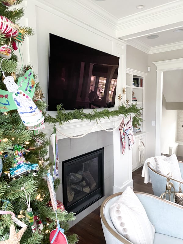
ACCESSIBLE BEIGE PAIRED WITH WHITE DOVE IN MY HOME
WHAT IS A GOOD ACCENT COLOR WITH ACCESSIBLE BEIGE?
Well, this all depends on what undertones you want to bring out. I decorate with both grey and coastal blue in my home, and both work very well with Accessible Beige. These cooler colors bring out some of the grey undertones whereas my oatmeal-colored furniture and rugs bring out more of the beige undertones.
I think the key is to choose accent colors with a tone that brings out what undertone YOU want to be most apparent. That is, I have cool tones with grey and light blue and this brings out more of the ‘grey’ in the Accessible Beige (however, it the color still doesn’t appear as a true grey). If I had more pinks and warmer accent colors, this would pull out more of the warm, pinky undertones.
You might also enjoy FOUR STEPS TO CHOOSE A PAINT COLOR.
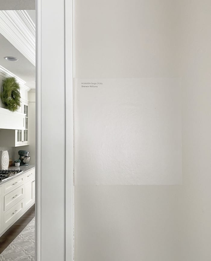
SHERWIN WILLIAMS ACCESSIBLE BEIGE SAMPLIZE SAMPLE
WILL THIS COLOR WORK IN MY HOUSE?
I can’t definitively answer this question for you, but I can give you some advice on how to determine if Accessible Beige will work in your house.
Remember this … just because a paint color works well in someone else’s house doesn’t mean that it will work in your home. Many neutral greige paint colors are believed to be colors that will literally work in anyone’s home. Do not believe this!
I highly recommend that you order a paint sample and look at it in all the elements in your home, including artificial (night) and natural lighting before you make a decision.
Be sure to determine how Accessible Beige looks in different rooms. Because of its grey undertones, it can really morph into a true beige or more of a grey-beige depending on the lighting present.
Make sure to stick your paint sample on the wall in each room you’re considering painting. A South facing room with a lot of natural light will show Accessible Beige’s true colors, while a north-facing room will cause it to look a little darker.
I hope this post all about Accessible Beige helps you get a little more clear on your decision of whether or not to use this color in your home. Remember … paint colors can look very different in different homes (and not to mention how different they look on a screen), so order several peel and stick paint samples of Accessible Beige to see how it looks in YOUR home before making a final decision.


